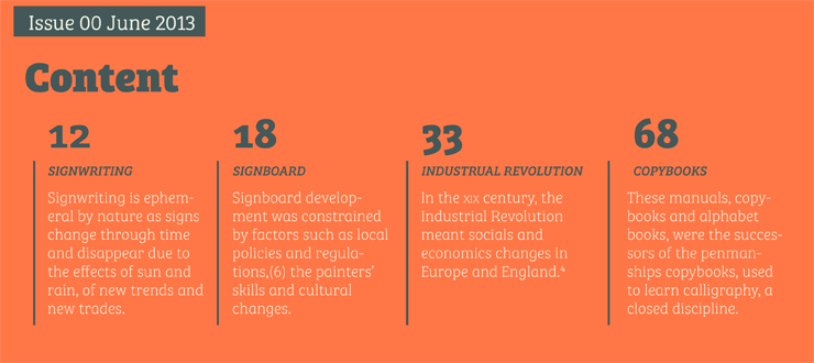
I found the above types very clear to read but also have a lot energy and preserve the modern feel at the same time. It won gold award in the European Design Award in 2014. The following is a brief history and characteristics of this "Bree Serif" font from http://www.type-together.com/Bree%20Serif
Bree Serif follows the same theme as its predecessor. It is a young and energetic upright italic that approaches readers with hip and somewhat elegant charm. It has a range of styles that can perform as counterparts to the original Bree fonts. At the same time though they bring a whole range of new and individual features that make Bree Serif a separate type family in its own right.
The characters in Bree Serif maintain the original flavour of handwriting, but have a more subtle appearance to support optimal editorial usage. The slabby nature of its shapes, particularly in the heavier weights, makes for a strong impression.
Some of the characteristic features of its sans serif cousin are present in Bree Serif too, such as the single-story ‘a’, the cursive ‘e’ and the rhythmical ‘k’ and ‘y’. Alternate letters of these are also available when a more neutral look is desired.
Bree Serif offers a mixture of fluid and attractive forms that convey a contemporary and vivid aspect. If you loved the multi- award winning Bree, you will surely love its seriffed cousin!"
The project information is below.


No comments:
Post a Comment